In the last post, we talked about gathering information to start your design. Now, the fun part! It’s time to transform the insights collected into a loose, initial design. I’ve detailed what that looks like for me below, but keep in mind that this phase is more fluid and the steps are only loosely ordered.

PHASE TWO: TRANSFORMING INFORMATION INTO A MVD (Minimum Viable Design)
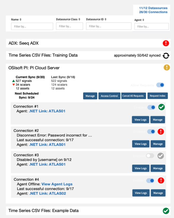
- Organize information. From phase one, I typically have one set of notes for each individual I interviewed, as well as my own thoughts from exploring the domain space. I collate these notes into one set of requirements and a list of possible design ideas. In this step, it’s important to make sure that priority is considered. I strictly order my requirements from most important to least important, and group them along the following categories: Must Have, Good to Have, Nice to Have, and Icing on the Cake (as in pretty but inessential). A good grouping will usually be lopsided, with the fewest requirements in Must Have, a few more in Good to Have, and so on. For example, here’s my list for datasource management:
Must Have:
- An admin page to view and manage datasources
Good to Have:
- Ability to edit connector configuration without server access
- Ability to troubleshoot disconnected datasources
Nice to Have:
- The expected state of datasources
- Ability to request an index
- Reduced confusion/concern for non-admin users over expected datasource reconnects
- More customer-centric sync statistics (ex. no relationships)
- Ability to manage access control
Icing on the Cake:
- Clear status on why a connection is disabled
- Common understanding of agents, datasources, connections, and connectors between customers and Seeq engineers
- Ability to “block” all requests to a datasource during emergencies
- Datasource health metrics
- Easy link to pre-populated workbook with datasource monitors
- Support for multiple connections to a single datasource
- Ability to create a new connection
- Ability to archive a datasource
- Research what exists. It’s highly likely that there’s a related precedent either within the company or somewhere on the Internet. This is particularly true for user interfaces and big picture architecture – best practices and inspirational components are readily available.
For datasource management, I looked at administration UIs and concepts in other applications across a variety of domains (such as smart home devices, SaaS products, hosting services, and award-winning dashboards). I also had several conversations with the squad responsible for the future administration overhaul to see what their other pages looked like.
- Outline a solution. This step varies significantly depending on the domain you’re designing in and the opinions expressed in Phase One. Sometimes you’ll need to piece together various opinions and fill in the details. Other times, someone points you in a clear direction because they’ve already formed a concrete vision. Or maybe there’s a lot of contention (or no strong opinions whatsoever), and you’ll need to really flesh out something from scratch. The important task is to get to a reasonable design that you can iterate from. It doesn’t have to be great or well-formed right off the bat – you can review requirements and keep amending the design until it’s reasonable. Here’s what to keep in mind while you shape your solution:
- Don’t factor in limited resources, unless the primary requirement is that the implementation effort is done within a very short timeframe (a few days or two weeks). Focus on designing an ideal solution (that is not impossible) right now. Later on, you can scale back based on PO priorities and timeline goals.
- Lead with usability. Assume that the people who are using your work are tired, hungry, and this problem (that you’re solving for) is only their third priority. It’s not enough to have something that works – it should be friendly and easy to use even when if someone’s distracted and unwilling to invest much effort in learning. This is true even if you’re not working on a UI workflow – even a configuration JSON file or method signature can and will be used under duress.
- Mockup or diagram whenever possible. It feels more real and people are less likely trip over pictures compared to words. It’s also easier to understand and be sold on a vision that’s expressed through a nice flow chart or wireframe than a hundreds of words. Remember that you don’t need to be “good” at this – drawing it out on notebook paper is perfectly fine. (If you’re working on a user interface, you don’t need to craft your own mockup first before consulting with the design team – especially if you’re struggling with it! The design team is happy to work with you in these early stages).
- Design by priority. You’ve already ordered your requirements! If you can, work with the design team to start crafting solutions with the most important pieces first (for example, an MVP wireframe that only accomplishes the first four goals). Then, add in lower priority goals, refactoring or reassessing when a user workflow becomes too complex, confusing, or useful for too few users. This is particularly important for user interfaces, because it can result in very different design outcomes (a workflow with lots of buttons and adjustable options that gives equal weighting to edge cases vs a simple workflow that works for most users).


- Brainstorm alternatives. Even if all of your interviewees believe in an “obvious” direction, there may still be valuable unexplored options. After all, you’re the one with dedicated time to think about this design – everyone else may be offering background opinions they’ve formed from working on tangential efforts over the last few years. And even if you’re sure that the idea that’s solidifying in your mind is the one, you’ll still need to communicate to reviewers that you’ve thoroughly explored the other options in your design.
For datasource management, I also wireframed several other workflows, including a customizable card-based dashboard, a datasource table, and expandable column-based dashboard. Although none of these took off, I did end up incorporating a few elements from these sketches into my primary design.

- Gather more information. You may now find that someone’s opinion doesn’t make as much sense with the new information you’ve collected since, or maybe you’re wondering if there’s wiggle room in a requirement that was expressed if you made a slight adjustment elsewhere. Perhaps you’ve found two good solutions, and you’re not sure which one is better – you didn’t get enough information from stakeholders about their preferences on newly relevant priorities. That happens, go back and get more details!
Now what? Find out in Phase Three: Validating Your Design.